CATEGORY:
BRAND IDENTITY,
IDENTITY SYSTEM,
TEMPLATE DESIGN &
PRINT MATERIALS
YEAR:
2022-
AGENCY:
160over90
THE GIST OF IT:
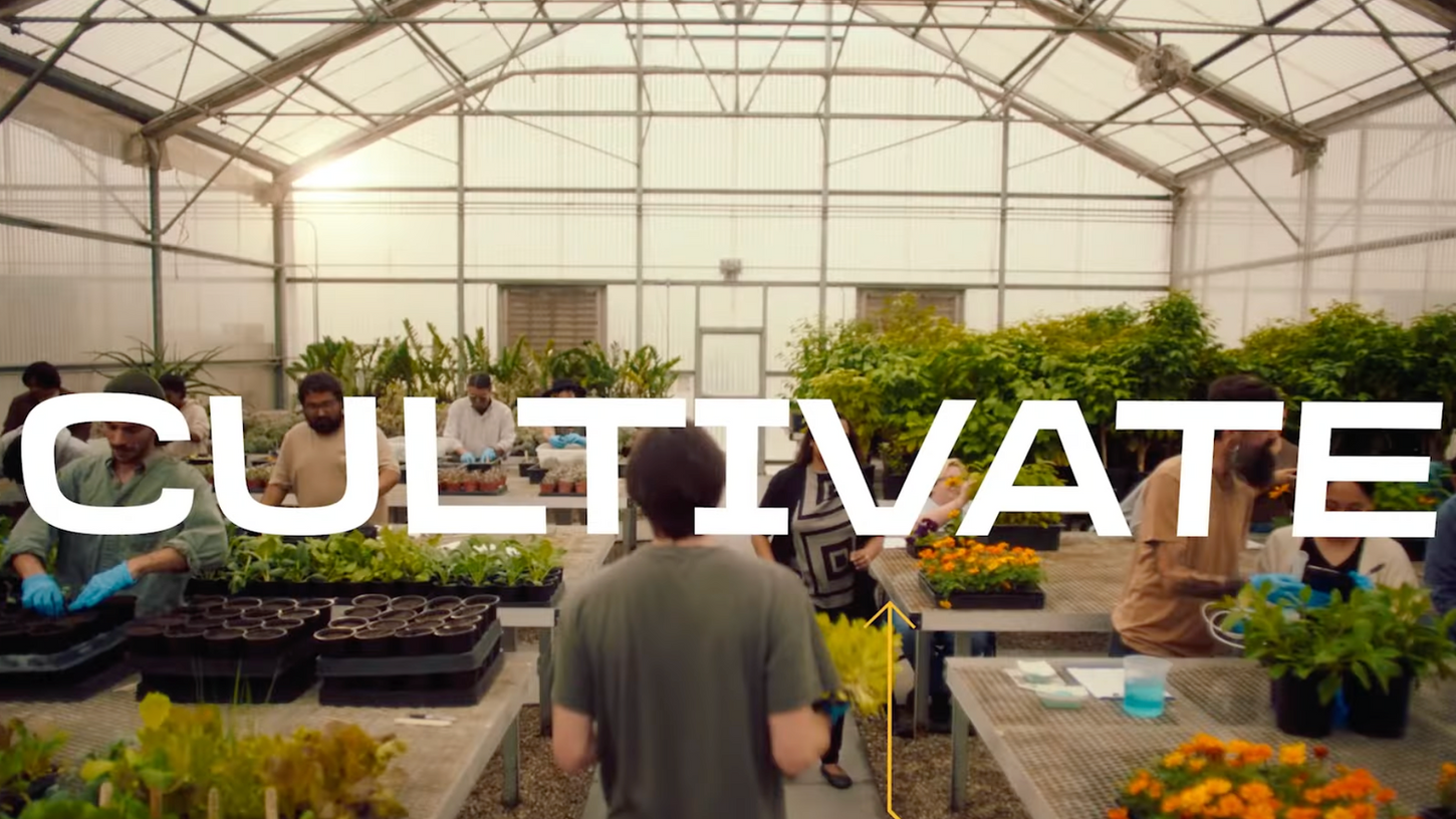
Cal Poly Pomona isn’t your typical college. From building a Rose Float as an extracurricular, designing a Formula SAE car for a final project, and caring for Arabian horses as part of your course syllabus, CPP’s PolyX approach makes it a hidden gem of a university.
After an underwhelming 2018 rebrand, Cal Poly Pomona turned to 160over90 to create a new identity system and branding that truly reflects the university, its alumni, and the broader community.

Since 2018, Cal Poly Pomona had been using a logo that felt inauthentic to its community in both symbolism and color. Through multiple rounds, CPP and 160over90 developed over nine logo options, exploring everything from icons to wordmarks.

The new Cal Poly Pomona logo highlights the campus’s most iconic building, Kellogg Stable. Its stylization and boundary breaks reflect CPP’s academic innovation, while the custom wordmark, echoing the icon’s arches, creates a logo that feels authentic to the university.


CPP’s motto is “Learn by Doing,” but students are doing more—they’re becoming. That inspired the campaign line, “Become by Doing.” The refreshed brand pairs the new logo with type, graphics, and colors that capture the energy and innovation of campus life.


