CATEGORY:
NAMING &
BRAND IDENTITY
YEAR:
2023
AGENCY:
160over90
THE GIST OF IT:
Youth sports aren't just about competition. They are about setting the younger generation on a path toward confidence and success in life, health, and school. But, according to the Women’s Sports Foundation, by age 14, many girls are dropping out of sports at two times the rate of boys.
No girl should ever have to give up playing the sport they love because they don’t have access to the most important piece of female sporting equipment: the sports bra. That’s where Operation Warm and their founding partner, the Philadelphia Eagles, come in.


After the gender-agnostic and play-focused name FLY:FWD won in our naming rounds, the next round was won by a bold, type-driven logo. The identity suite checked the boxes for both clients. Operation Warm loved the “blocky and thick” typestyle, while the Eagles were hooked with our Easter egg “swoops.”


Operation Warm and the Philadelphia Eagles each had their own vision—Operation Warm: a bold wordmark, the Eagles: subtle brand nods. We explored everything from symbolic to literal, refining through four rounds until the final design resonated with both teams.


While the initial question was “What does the logo look like on a sports bra?,” we knew the brand needed to go further. From delivery boxes to merch, building a full visual system for FLY:FWD ensures the brand’s longevity.


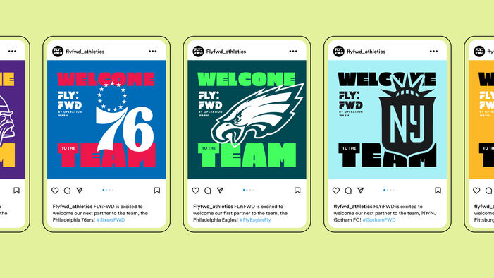
While the Philadelphia Eagles are the founding partner of FLY:FWD, there was a desire from the Operation Warm team to have the brand flex to other prospective partners, really expanding the FLY:FWD universe.


Handing off a project you love is never easy, but Operation Warm stayed in touch—inviting us to their North Philly launch, where a fraction of the 30,000 donated bras were distributed with support from Jalen Hurts, Laila Ali, Carli Lloyd, and others. Yes, we got a signed bra, proudly displayed at the 160 Philly office.


PROJECT OUTCOMES
30,000+
Sports bras donated
8
New partners, including WWE, the Pittsburgh Steelers, and FedEx
of Athletic Directors witnessed an increase interest in sports programs
2024 Operation Warm Athletic Director Survey.
86%


